Target species
Three species. One map.
Purpose-built HSI models for each species — tailored thermal ranges, prey signals and habitat preferences.
Actively expanding. RipVision AI currently tracks SBT, YFT and Mahi-Mahi. Additional species — including Striped Marlin, Broadbill Swordfish and Albacore — are in development and will be added as models are validated. This is a living product, growing with each season.
HSI Layer
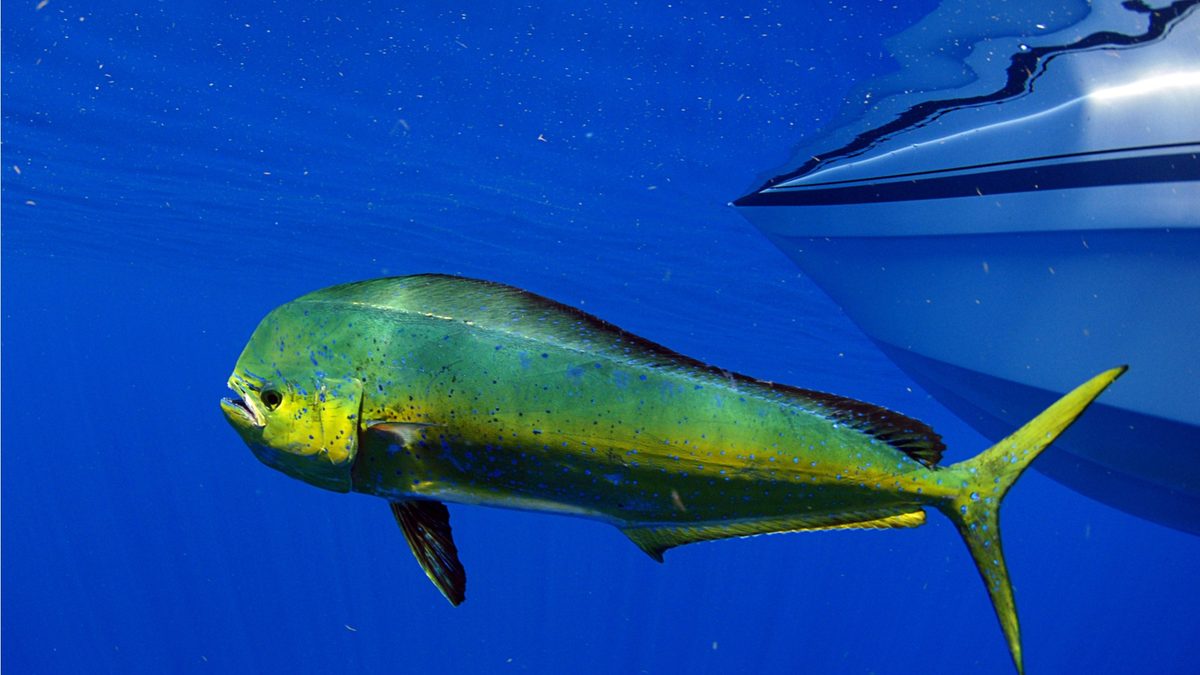
Mahi-Mahi
Coryphaena hippurus
HSI Layer
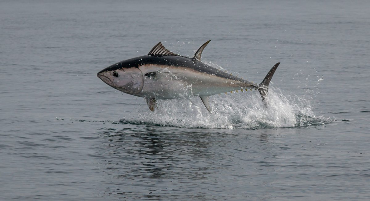
Yellowfin Tuna
Thunnus albacares
HSI Layer
Southern Bluefin Tuna
Thunnus maccoyii